I joined Focal shortly after they graduated from Y-Combinator, as the 8th employee and sole designer. As such, I was given the responsibility of thoroughly understanding our users, informing our strategic direction with the research, working with our team to execute the visions and products, and also spending time with our clients and users onsite.
During my time at Focal, we pivoted the original product, found product-market-fit with a different client base, raised a Series A, moved offices (and painted decals on walls!), launched and piloted our flagship product across several continents, and thoroughly researched and conducted pilots for innovative methods of automated checkout.
I was part of the Focal team for just under 3 years, traveled to many onsite locations, and learned to not only build products, but also built a lot of grit. Below, you'll see an overview of 4 major categories of our work during my time at Focal.
← Back to projects
On this page
1. Client monetization 2. Automated checkout3. Fleet management4. Shopper engagementOSCAR · INDIVIDUAL CONTRIBUTOR
Focal systems
Client monetization suite
Overview
In this project, I worked closely with our sales and customer success teams to determine the top pieces of data for decision making, and created key metrics to provide our retail partners. We also experimented with which modalities would convey the information best to our clients.
93%
satisfaction overall from clients using the suite of tools at the time I left.
1
year refining the suite of tools and communication mediums.
The final suite


Business intelligence admin dashboard
Stocker action tool
Real time in-store analytics
Inventory text updates
Eliminating manual scanning with computer vision
Current state
Currently retailers rely on manual labor to scan out-of-stocks, which takes 2-3 hours a day, as well as chronically inaccurate computer generated ordering systems to order products and track inventory, which cause a snowball of problems down the chain. The system is so broken that routinely the store needs to wipe their inventory system, and manually count each SKU to reset the data.

With Focal Systems
With Focal’s help, there could be continuous, real time, Out-of-Stock detection. Focal Systems deploys camera modules into brick and mortar retail stores. These modules are attached to shelves and take photos at custom intervals of the opposing shelf. From the images, Focal runs proprietary computer vision based deep learning models to detect out-of-stocks. 6 of the world’s largest retailers are currently using our system across 3 continents.

Making the data actionable
I spent a few weeks diving deep into store processes, shadowing store managers and staff, conducting interviews, and observing their day-to-day.
That's when we had the "ah-hah!" moment. We realized that our solution could not be a one-size-fits-all solution. Each of our stakeholder groups had different goals, needs, and work habits that would change how they needed to consume the data.
That's when we had the "ah-hah!" moment. We realized that our solution could not be a one-size-fits-all solution. Each of our stakeholder groups had different goals, needs, and work habits that would change how they needed to consume the data.
3 Stakeholder groups, 3 sets of user needs
User group
Goals
Day-to-day responsibilities
Best method of communication
Corporate teams
Make strategic planning decisions on inventory selection, product placement, delivery schedules, and more.
In an office, reviewing reports, and in meetings.
Web based application or email.
Store managers
Ensure store is in best condition from stocked shelves to short checkout lines to clean floors.
On the store floor stocking and helping customers. Occasionally in the office taking meetings or viewing email.
Email for anything non-urgent, and text message for immediate attention.
Store staff
Keep shelves as fully stocked as possible.
Constantly moving between the backroom and the floor restocking products and helping customers.
Text message
Determining how our data can help answer their most burning questions
Understanding incentives
To understand what the key metrics were, I worked with the sales teams to understand each user group’s motivations and responsibilities. The data should provide the tools necessary to make short term and long term business decisions.
I took these insights and organized them under each goal category to provide a structure for the BI tool.
I took these insights and organized them under each goal category to provide a structure for the BI tool.

Turning key metrics, into dashboard components
From the metrics, I worked with our Data Scientist and QA Engineer to create a Master Component Library for each data piece.
Image blurred to censor sensitive content
Image blurred to censor sensitive content

Building the customer journey
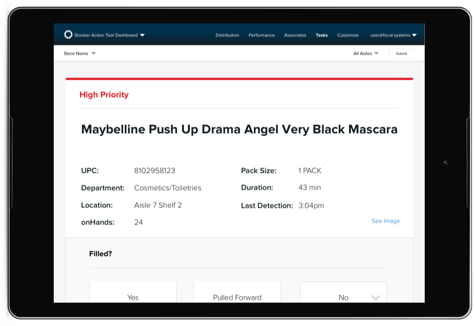
There is never a dull moment in a store stocker’s day. This means that our tool needed to be very simple and easy to use.


Ideate, iterate, test, update
Wireframing with unknowns
We needed to integrate with client systems to pull in relevant data so associates can take action immediately. However, each client is strict about sharing certain information so we wouldn’t always get what we needed. This meant we had to brainstorm for many edge cases.

Site layout and information architecture
Once we knew what components and data points to display, We needed to carefully consider how those components would be grouped, how users would move from tab to tab, would they be able to answer their questions without tabbing too much, and how do we progressively disclose information to support users diving deeper into the data?

Hifi mockups and usability testing
Once we had tested a few ideas, we moved forward to hi-fi mockups. I created prototypes that our users could play around with, and for some features attempt to use while walking through the store.
Continuously rapid prototyping and experimenting
Flexing old Python skills
Based on these new communication methods, I put my Python hat on and wrote the scripts to quickly prototype the following systems.


Text message updates to store staff with progress on out-of-stocks worked and remaining throughout the day.
Text message updates to store staff with progress on out-of-stocks worked and remaining throughout the day.
Email progress updates to store managers with lost sales information to showcase ROI.
A leaderboard of associate progress to incentivize friendly competition.
Current state of the suite
After reviewing the data and collecting feedback from these experiments, we narrowed down all the prototypes to the 4 worth continuing.
Business intelligence admin dashboard
Stocker action tool
Real time in-store analytics
Inventory text updates
A cart-based automated checkout system
Overview
This project was a fully-fledged research effort to understand what it would take to design a newer, faster, checkout process. Narrowed down core interaction method ideas from 6 to 1 and reduced user errors in scanning products. We were simultaneously developing the technology and hardware, but from my research we understood that deploying a cart-based solution that was not fully baked, would not set us up for success. We decided to pivot the mechanism to use our well-tested mounted camera system, on checkout belts.
40%
less time per shopping trip. Those were our estimated time savings from the final prototype.
6
core interactions (cart-based, scanning, computer vision, kiosk, etc) reduced to 1 final solution.

Checkout needs a fresh look
While Amazon Go is the only deployed breakthrough attempt at cashier-less checkout, there is over a decade of research and experiments in this area. Customers are on average unsatisfied if the checkout line is longer than 3 minutes. Self checkout machines and their relentless “Unrecognized item in bagging area” drives people crazy.
For the past decade retailers big and small have tried mobile checkout applications, handheld scanners, self checkout machines, barcode scanning conveyor belts, smart shelf tags, and much more. However these solutions increase theft, have high hardware costs, have frustrating user experiences, or create inaccurate product detections.
For the past decade retailers big and small have tried mobile checkout applications, handheld scanners, self checkout machines, barcode scanning conveyor belts, smart shelf tags, and much more. However these solutions increase theft, have high hardware costs, have frustrating user experiences, or create inaccurate product detections.
Gathering data, and understanding the human factors
After extensive literature review on existing solutions, I began the fun stuff. I headed out to the field and spent a week visiting retail establishments of varying sizes and demographics.
I conducted time and motion studies, interviews, and tested systems myself. Though the numbers gathered may be found in existing literature, understanding the human experiences surrounding the numbers is what helped me create a new system.
I conducted time and motion studies, interviews, and tested systems myself. Though the numbers gathered may be found in existing literature, understanding the human experiences surrounding the numbers is what helped me create a new system.


Adding something new to mobile cart interfaces
I studied e-commerce and mobile cart interfaces to understand existing components and read customer reviews for areas needing improvement. I tested a few ideas to enhance customers’ shopping trip without being a nuisance.
1. Giving the shopper an anonymous identity to engage them through the trip

2. Displaying a fun fact about random items in their cart.

3. Categorizing their basket into product types to mimic their mental shopping list.

Other ideas that got ruled out due to technical constraints:
- Adding notifications of when other shoppers also bought an item in their cart
- Seeing a heatmap of where all the shoppers were in the store
- Searching for any product in the store
- Checking if a product is in stock or out of stock
Creating an effortless scanning experience
V1: Barcode scanning, V2: Computer vision
The way a user would interact with V1 is by scanning the barcode with the tablet. This interaction needs to be exceptionally intuitive, otherwise it will not be a better experience than having a cashier scan everything.
The desired final solution is to “just throw it in the cart”, however there must be intermediary products before that. V1 is where I focused my testing.
The many external factors to design for
There are many factors to take into consideration for the hardware design of the tablet and barcode scanner.
There are many factors to take into consideration for the hardware design of the tablet and barcode scanner.
- Where/how should the scanner be housed so it is most ergonomic for most product sizes, shapes, and weights?
- Where should the scanner be to accommodate people of heights, strengths, and age?
- How are variable weight products handled?What happens if there is an error?
- How do we prevent theft?
- What materials do we use so that it's scratch and weather resistant?
Duct tape is your best friend
In the spirit of rapid prototyping I rummaged through our hardware supply room and put my arts and crafts to work.
Round 1
Phone bound to cart and basket
Purpose
Create concept clips trying out different interaction options in the store as a bodystorming exercise. This helped me understand what movements were awkward, and what were natural.
Users
Myself, and colleagues at the office
Phone bound to cart and basket
Purpose
Create concept clips trying out different interaction options in the store as a bodystorming exercise. This helped me understand what movements were awkward, and what were natural.
Users
Myself, and colleagues at the office

Round 2
Cardboard, styrofoam, plexiglass, wired 2D barcode scanners, and lots of tape
Purpose
Narrow down 6 scanning interactions to 2
Users
53 random shoppers in stores scan 1-2 items for each interaction
Cardboard, styrofoam, plexiglass, wired 2D barcode scanners, and lots of tape
Purpose
Narrow down 6 scanning interactions to 2
Users
53 random shoppers in stores scan 1-2 items for each interaction

Round 3
Styrofoam, plexiglass, custom ordered scanners, and lasers
Purpose
Narrow down 2 scanning interactions to 1
Users
Shadowed 4 scheduled user interviewees and had 25 random people in stores test 2-5 items each
Styrofoam, plexiglass, custom ordered scanners, and lasers
Purpose
Narrow down 2 scanning interactions to 1
Users
Shadowed 4 scheduled user interviewees and had 25 random people in stores test 2-5 items each

Round 4
3D printed prototype with embedded scanner and laser
Purpose
Confirm the scanner interaction and choice of custom laser part
Users
Shadowed 6 scheduled user interviewees on full 30-45min shopping trips
3D printed prototype with embedded scanner and laser
Purpose
Confirm the scanner interaction and choice of custom laser part
Users
Shadowed 6 scheduled user interviewees on full 30-45min shopping trips

Conclusion: Scanning below the tablet was most comfortable for most use cases
These were the results from several weeks of field testing yielded the bottom facing scanner as the majority winner. I documented each user testing session's details, the user's pick, and their rationale. Because different shoppers will have different preferences based on their age, height, physical ability, etc, I also broke down all the results by demographics.


Other conclusions from the hardware UX testing:
- Interaction: Multi-direction barcode scanning support is vital, with visual guide of scanning zone
- Interaction: Users begin to develop muscle memory of scanning zone, so device needs to be extremely rigid as to not change that angle
- Hardware: A scanning device tilt of 20-30 degrees is optimal
- Hardware: The battery draw of using a proximity sensor is far less than keeping a camera open
- Software: Audio feedback of successful or rejected scan is necessary
Diagramming findings
I created a system flow diagram that illustrated how the full tech stack was involved in the user flow, and vice versa how the user's workflow impacts the software and hardware. I pointed out several possible execution methods and edge cases there are to design for.

The final UI
I designed and prototyped happy path cart states, age/restricted item checks, animations for the scanning interaction, empty states, error states, you name it.

Demoing at NRF
We showcased our automated checkout technology alongside our other inventory platforms at National Retail Federation, Retail’s Largest Tradeshow, in 2018 and 2019.
Fleet management suite
Overview
Our fleet of homegrown tools support the installation, maintenance, monitoring, and troubleshooting of hardware issues in the field. These tools are heavily used every day by the infrastructure, hardware, and field teams to manage our hundred of cameras deployed all over the world with our retail partners.
For this project, I helped streamline 23 separate tools into 12 and drastically lowered barrier to entry for new employees. We completely overhauled the UI and made it mobile compatible.
For this project, I helped streamline 23 separate tools into 12 and drastically lowered barrier to entry for new employees. We completely overhauled the UI and made it mobile compatible.
95%
Increase in mobile usage of our tools.
4
months to rapidly execute on the work.
Not set up for scale
Like any startup, many of our tools for operations were built feature by feature as the needs arose, without much pause for consideration about the longterm scalability. That's a problem we'll solve if we're lucky to have it!
And soon, we were. That's when we needed to take a look at our set of fleet management tools and really understand how to streamline the in-field workflows and improve the tools.
The main issues I discovered were:
And soon, we were. That's when we needed to take a look at our set of fleet management tools and really understand how to streamline the in-field workflows and improve the tools.
The main issues I discovered were:
- Many tools were bloated with legacy features
- Workflows were separated into multiple locations or duplicated in multiple tools
- Documentation was kept separate from the app, requiring multiple applications
- UI had no hierarchy and was confusing to use
- There was no mobile support, but our field techs were, well, in the field all the time!
Becoming a field tech for a week
I spent a week shadowing field team members to understand their processes and expected results. After observing, I went out to perform the tasks myself to understand firsthand where improvements could be made. After interviewing each field operations member, I brought all of the stakeholders together for a brainstorming session. I then took the brainstorm notes, distilled it into features and bugs, and grouped them by process / category to create individual project charters.

A complete redesign effort
Stripping the bloat
Based on the research, I could determine unnecessary features. I cleaned up the legacy tools that no one used any longer. While reorganizing the tools, I also mapped out where the new features from the brainstorm would fit in.
Based on the research, I could determine unnecessary features. I cleaned up the legacy tools that no one used any longer. While reorganizing the tools, I also mapped out where the new features from the brainstorm would fit in.
Before: Navigation contents
After: Navigation contents


Improving “quick glance” abilities
The most important tool is the ability to monitor, identify, and asses device hardware issues in the field. I focused on making this tool mobile-first design.
The most important tool is the ability to monitor, identify, and asses device hardware issues in the field. I focused on making this tool mobile-first design.
Before: Devices dashboard
After: Devices dashboard


Automating previously manual tasks
The most important tool is the ability to monitor, identify, and asses device hardware issues in the field. I focused on making this tool mobile-first design.
Crud for content
Version control for the multiple pieces on software on each device was tricky business. When one engineer holds the key to knowledge of the current versions, we had a problem. This new content management system allowed users to view current versions, update versions on specific devices, and managed version naming automatically.
Version control for the multiple pieces on software on each device was tricky business. When one engineer holds the key to knowledge of the current versions, we had a problem. This new content management system allowed users to view current versions, update versions on specific devices, and managed version naming automatically.

Creating internal alerts
Version control for the multiple pieces on software on each device was tricky business. When one engineer holds the key to knowledge of the current versions, we had a problem. This new content management system allowed users to view current versions, update versions on specific devices, and managed version naming automatically.
Version control for the multiple pieces on software on each device was tricky business. When one engineer holds the key to knowledge of the current versions, we had a problem. This new content management system allowed users to view current versions, update versions on specific devices, and managed version naming automatically.

A frontend for the data mdoel
Previously store and user settings could only be changed directly in the database. With a GUI, now team members with the correct permissions could update settings, with caution!
Previously store and user settings could only be changed directly in the database. With a GUI, now team members with the correct permissions could update settings, with caution!

A new design language
As seen in the designs above, I created a new design language for the field and internal tools products. New guidelines for typography and component styles has helped engineers follow the same visual style in new features.
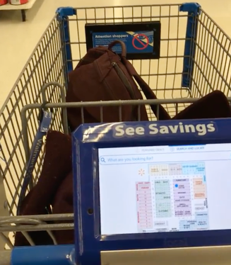
Shopper Engagement Tablet
Overview
The shopper engagement tablet’s purpose is to digitize the retailer’s weekly circular on a tablet mounted to the shopping cart. The deals were contextual to your location in the store and would save the retailer millions of dollars a year printing the ads.
I crafted user experience of cart-mounted tablet providing location based advertising and in-store product search and navigation. Deployed over 500 devices in major retailers. The tablet has an average of 3.6 / 5 stars across 2386 post trip surveys and has proved an 11% increase in sales.
I crafted user experience of cart-mounted tablet providing location based advertising and in-store product search and navigation. Deployed over 500 devices in major retailers. The tablet has an average of 3.6 / 5 stars across 2386 post trip surveys and has proved an 11% increase in sales.
11%
increase in sales due to improvements
3.6/5
stars for member satisfaction across 2386 post-trip surveys
Local supermarkets vs. big box
We were still finding product market fit. So we needed to know what the needs of potential retail partners in various market segments as well as their clientele's needs. So, I spent weeks traveling to both our local supermarket partners, as well as to our international big box retail partners to perform initial user research and discovery.
There are key differences between the local markets and the major retailers that impact the potential benefit of our system. These findings helped us focus our attention on the right market. Eventually, we decided that the product was worth pursuing with the big box retailers, but sunset it for the local supermarkets.
There are key differences between the local markets and the major retailers that impact the potential benefit of our system. These findings helped us focus our attention on the right market. Eventually, we decided that the product was worth pursuing with the big box retailers, but sunset it for the local supermarkets.
Local supermarkets
Big box retailer
Which is better for Focal?
Description
Your mom&pop local grocer. May have 1-5 locations in the region.
Your Safeways, Walmarts, and Tescos of the world.
--
Location
Residential communities
Commercial neighborhoods
Big Box
A community feels protective of its residents, and technology threatens to eliminate jobs.
A community feels protective of its residents, and technology threatens to eliminate jobs.
Clientele
Regulars who visit 2-3 times a week. Enjoy engaging with the staff.
Residents of neighboring towns or passerbyers.
Big Box
Regulars know where items in the store are located and don't need the tool.
Regulars know where items in the store are located and don't need the tool.
Focusing on Big Box
It was pretty clear from the market research that I did, combined with conversations that our founders were having, that Big Box was the way we needed to go. At that time, we already had 10+ retail partners in the local supermarket space because we could build relationships and have very high-touch pilot programs with them, since they were our neighbors.
As we now understood who our target users were, I began the work to design the next generation of the app, for them.
As we now understood who our target users were, I began the work to design the next generation of the app, for them.
Contextual inquiries and interviews
These interviews provided insight on shopping behavior and user pain points that would lead to features.
These interviews provided insight on shopping behavior and user pain points that would lead to features.

A/B testing
From features, to call to action stickers, to survey launch logic, A/B testing allowed us to empirically compare the best design options.
From features, to call to action stickers, to survey launch logic, A/B testing allowed us to empirically compare the best design options.

Live testing prototypes
Every second counted in the search loading, advertisement animations, and navigation updates, so I would work with engineers live in store to test these parameters.
Every second counted in the search loading, advertisement animations, and navigation updates, so I would work with engineers live in store to test these parameters.
Iterating on designs
Brainstorming multiple UI layouts and interaction patterns for various features to test.
Brainstorming multiple UI layouts and interaction patterns for various features to test.

Making 6 major changes in 6 months
From all the research, the major changes I was proposing in the redesign were:
- Introduced context by creating location-based ads, rather than just a laundry list
- Complete redesign of UI – no more Lobster font!
- Major UX enhancements including navigation, tabs, text hierarchy, and call to actions
- Worked with data scientist to improve UX on search
- Worked with hardware team to increase size of tablet for next generation
- Cut two major features that hindered adoption
Before
After


Designing for divided attention
The biggest challenge was to capture, and then keep the attention of the customer. Customers are trained to look up while in stores, not down at the cart. This forced us to explore other sensory input options like:
- Light – dimming and brightening the screen
- Sound – using a small jingle or sound at certain CTA points
- Touch – creating haptic-like vibrations
- Color – choosing bright popping colors to catch the user’s peripheral attention
- Motion – incorporating animations to catch the user’s peripheral attention
We prototyped these options, and resulted in using a combination of color and motion.
Every second counts
Due to the divided attention of our users, we had to pay close attention to every point where we could lose a user’s attention.
How many seconds do we wait...
How many seconds do we wait...
- before rotating the featured products?
- after a user gets in the checkout line before we trigger the after-trip survey?
- before automatically turning on the tablet?
- before skipping the onboarding screens?
- before automatically switching tabs?
- between each location refresh?
Proven increase in sales by 11%
Our team’s hard work paid off. We earned our retail partners an average 11% increase in sales. This percentage was huge for our clients since retail is a very low-margin industry.
Final designs and flow
Location based advertising
As a shopper walks through the store, the ads animate and rotate as you become closer to more relevant, actionable deals.
As a shopper walks through the store, the ads animate and rotate as you become closer to more relevant, actionable deals.

Search by category
Most search terms received by our device are one to two words. However, a word like “milk” could be in products like “Whole Milk” or “Milk powder”, which are in different locations. To support this, we break down search results by category, weighted by the frequency the items in each category are bought.
Most search terms received by our device are one to two words. However, a word like “milk” could be in products like “Whole Milk” or “Milk powder”, which are in different locations. To support this, we break down search results by category, weighted by the frequency the items in each category are bought.

View shelf location
Once a shopper narrows down to the item they are looking for, the tablet begins navigation as well as showing a real time shelf location of the product.
Once a shopper narrows down to the item they are looking for, the tablet begins navigation as well as showing a real time shelf location of the product.
